Last week, I shared that I was writing a “Life List” after being inspired by the Netflix movie. One of the items on that list was to “Design something, or creatively explore something else.” I’ve always just considered writing as my form of art, but there are so many more creative avenues that I can explore. So, I took some initiative and started learning how to draw/paint with the Art Academy lessons, and I wanted to share the notes I took today. As a beginner, I think I might be able to offer information that other beginners also don’t know to improve their own work.
What is Art Academy?
Art Academy was a program for the Nintendo DS System. It taught users different art skills, and received praise for how realistic it was to the skills that they were teaching, whether it was line drawing or painting, to sketching or working with pastels.
I chose this route to pursue my creativity for many reasons. Growing up on the Nintendo DS, I loved that this could kind of bring me back to my childhood (which was another item on my Life List). Choosing this route also gives me a flexibility in not having to sign up and attend a class that takes place at a specific time. It also gives me the comfort of embarrassing myself in my own home instead of looking like an amateur in front of strangers. So for me, Art Academy was the best choice for what I needed.
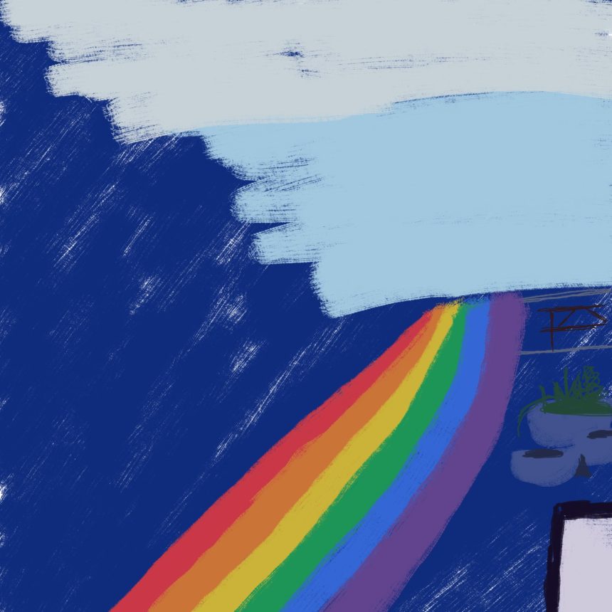
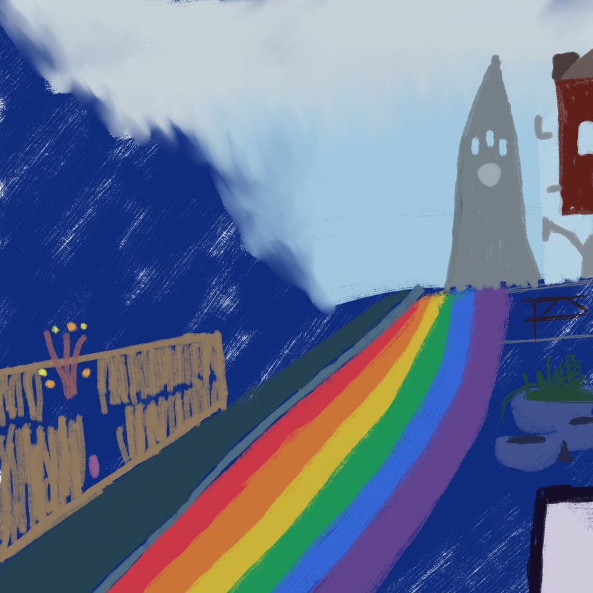
I don’t have my images from the lessons themselves, and maybe I’m not ready to share them yet. The images I am going to share is the process of a rough sketch using the Krita program, and I will preface this by saying that they are not good at all. But my sister Jasmine says that is all part of the process, and it makes sense because I am a beginner.
1. Base color is the dark color, and the light colors are painted on top.
I always thought that it was important to have a white paper so you can manipulate it however you want. It turns out that I was wrong, and it’s better for you to consider what your subject is and to layer the page on the bottom with the dark color of your subject. In my mind, this led me to believing that art could be more accessible, because you would just work with what you have. In this case, I am thinking of all of the construction papers that I have but didn’t use because they weren’t the color I wanted at the time. Now I can think of how their color will lend themselves as a base to the paints I have.

2. Blending involves water and/or dry brush.
I always thought that gradients were used by blending whites into the color, but it turns out that is not true. You can mix the colors with water to blend them out, or by taking a clean, dry brush and pulling the color outward. I didn’t know that before, and it was really cool to see this idea in action.
3. Dimensions are created through highlights.
When it comes to art, I’ve always been drawn to images that have more lights in them and how that plays out in a piece. It’s why I’m a huge fan of Thomas Kincaid, and that might be why I felt the need to take this note down. In seeing how light plays on a subject and further emphasizing that in your art, you can create dimension on the page and maybe even show emotions you might hold about a subject.
4. Painting background helps to alter mistakes down the line (even if the background is white).
I feel like this goes back to that first note that I took, about the darkest color being the background. After putting it to practice, I can see that if the background is a color determined by you, the artist, then it can also be used as an eraser. As you are painting your subject, if you make a mistake, you can wait until the end and use that background color to go in and hide it. It should be dark enough to hide it, and therefore anything that you might paint over it.

And those are the notes from my first Art Academy lesson. Are there any basics about painting that I should know but didn’t cover here? What type of paint medium do you prefer? How did you first get into art? Let me know in the comments below!
As always, thank you so much for taking the time to read this blog! If you enjoyed what you read, please let me know by liking this post, commenting your thoughts down below, and sharing this with your friends. And of course, you have the ability to make my day by subscribing to the blog, which means that you’ll get updates anytime I put out more content like this.
Love Always,
Kristi My